|
I met with Misty at a cute corner coffee shop in downtown Bath, Maine, the city of ships. Cafe Creme is the hangout of choice for many of the locals and boarding school students alike. Its intimate atmosphere encourages conversation and camaraderie, and the sea of treats under glass domes at the counter along with row of local coffees along the wall encourages you to stay awhile. Misty had heard about me from my SCORE mentor. If you are unfamiliar with the SCORE program, its mission is to match entrepreneurs with seasoned business veterans. Misty, a mom with young kids like myself, was a massage therapist by trade, and working on developing an incredible app she called Thoughtful Giving. At the time she had entered the LA Top Gun competition to win funding for her business idea and wanted to connect with me to learn more about branding and design. I was more than happy to meet with her as one, she was obviously a fellow go-getter, two, I love talking branding and design, and three, my mom ran a gift shop my whole life up until this past year so I felt Misty would be a kindred spirit. Once we had our coffee and pastries in hand, she explained to me the beautiful idea she had that was the Thoughtful Giving app. "If you have nieces and nephews and want to get them a gift for their birthday, you always have to ask their shoe size, their clothing size, who their favorite super hero is etc. This app will allow you to share profiles of you and your family members with friends and family so they will always have access to the crucial information needed to purchase gifts," she said. "Furthermore," she continued, "it will be connected with banks so you can contribute to their college fund, or make a donation to a cause they support." As a mom myself who gets invited to birthday parties, this idea sounded brilliant. No more having to interrupt my friends and family members to ask what they or their children wanted for holidays and birthdays. I told Misty about the applied color psychology system I use to style brands, and we went over Spring, which she absolutely needed to use as either the dominant or supporting season as it communicates youth and aspiration, and Autumn, as Autumn communicates friendliness and philanthropy. I sent her home with printouts of the Spring and Autumn style cheat sheets, and wished her good luck in the competition. Fast forward to a year later, and Misty reached out again to see if I was interested in helping her create a brand identity for the app. She had a developer on board and with Covid, was able to spend more time than usual on forging ahead with launching this oh-so-helpful app. I told her about my Done & Dusted special, and we set up a time for our first meeting to go over the brief. Now, as we had already spent some time together in person talking about this brand, I felt I had a good grasp on what she was looking for. Our first meeting went more quickly than most. We went through her answers to the questions I have anyone working with me fill out and then I told her I was excited to get to work on the project. Here is her original logo that she had created for the Top Gun competition. She hired someone on a design site I believe for $25 to get this created: The colors are not harmonious, and while it is very legible, it feels like someone used clipart to throw together. I started with creating a new color palette pulling from Autumn. These colors are so rich and lovely, they unconsciously pull you in. Here is the palette I created for her,
I then worked on creating a logo. Now, I love the raspberry color, and felt it was very festive. So all the logo designs I worked up used this as the main color. Here is one of my first designs also showing some of the different gift images she could choose from:
However, on our next Zoom meeting, we decided to go back to the original main colors of orange and teal as the dominant colors. Orange because it communicates warmth and abundance. And teal because it's a blend of the nice balancing and abundance properties of green and communicative properties of blue. A gift is a type of communication that you appreciate someone. We spent quite some time both apart and together looking at typefaces. We tried Andika, Arapey, Arima Madurai, Bellota Text, Comfortaa, Harmattan, Mada, Thasadith, and ultimately decided upon Mallanna. It was friendly and simple, easy to read on a very small screen. As for the gift, we liked the one with the gradient package, and knew we wanted to keep the heart-shaped bow from the blue clipart gift. I tried doing a small tweak and seeing what it would look like if the ribbon jumped up and crossed the "T" of Thoughtful, but ultimately we decided to keep the gift on its own as it was more legible across applications. Gift with the ribbon on the "T":
And here is the final logo:
I also created a few different versions that could be used across different applications:
Lastly, I created a mock up of what the phone app image could look like:
Now that we had the logo finalized, it was time to continue with the brand identity creation. In order to do this, I find it is easiest to find an application to which you are going to apply the brand style. Luckily for me, Misty had shared with me a Word document mock-up of what one of the profiles would look like. BEFORE:
We had used Autumn colors, so I knew we next needed to add some Spring elements to bring that lightness and aspect of future aspiration. I created a fun confetti pattern of little repeating triangles in the brand colors.
Next I found some icons on Canva.com that allowed me to edit their colors to match the brand identity colors.
And I knew it needed a bit of a gradient pop so added this texture:
Then we played with typefaces in a Word document to decide on a fun heading font and a simple paragraph font. Here is the final profile mock-up with our updated brand style elements applied. AFTER
This is what the app would look like if you were logged in on a computer, and we talked a bit about how it would be designed differently as a phone app. We did a Google image search around phone app user interfaces and Misty now has an idea of what she likes. Once the developer is ready for a user interface, that will be the next piece to design. The Thoughtful Giving app now has a one-page style guide, so Misty is able to easily share the styles with anyone working on the project.
Good luck to Misty, and I know I am excited to be able to use this amazing app!
0 Comments
 Red is a very powerful color. Just looking at it raises your blood pressure and whets the appetite. Red is physical, it is the color of life itself. Red blood, red lips, full red tulips and roses. Apples beckoning you to eat them, bright red berries enticing you with promised sweetness. Red screams come closer and consume me. It is associated with masculinity, and exudes strength and power. (Let's just be clear here – women have just as much strength and power, this color just happens to communicate the strength and power of the male variety.) Super heroes done red capes, and countries often choose it for their flags. Red is one of the colors that jumps out at you and makes you think it is closer than it really is. Which makes it an excellent choice for stop signs and red lights. It also makes it an excellent choice if you have a brand that you want to be noticed. The most prominent brand of all time uses red as its main brand color:  In fact, before Coca Cola, Santa Claus wore white. Which makes sense, it's the color of snow and winter. But then in came Coke and published the iconic image of Santa in Coca-Cola red robes downing a bottle of the sugary liquid. And ever since, at least in the U.S., Santa has donned only red ensembles. 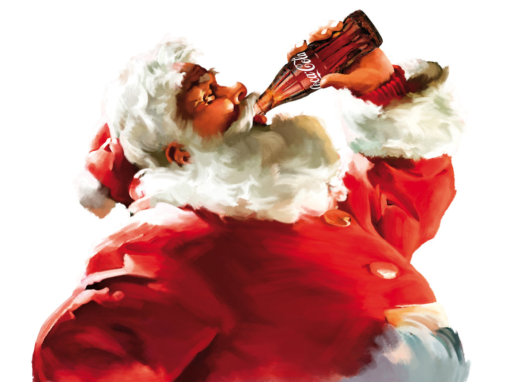 Side note - it is in thanks to Finnish artist Haddon Sundblom (1899-1976), commissioned by the US Coca Cola company, who painted the first Santa in red drinking coke in the 1930s. In languages that only have two words for colors, those are black and white. But in languages that have three words for color, those are black, white, and red. If you want to build your brand around one of the following, red would be a good choice to use as your main brand color,
For example, here are some brands who want to make us hungry for food; 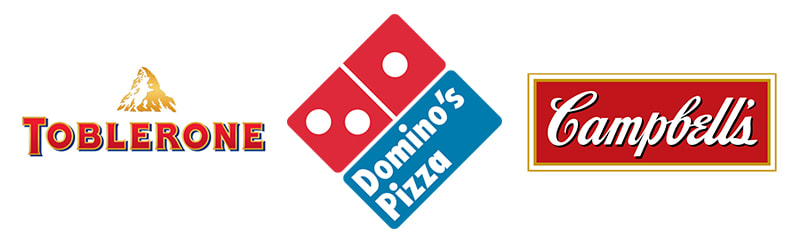 And some who want to make us hungry for adventure and excitement;  Once you have decided that red should be in your palette, next you will need to choose the shade of red. Here is where our secret weapon of applied color psychology comes in. If this is the first time you have heard of color psychology, go ahead and jump over to my explanation here. You can also download the Brand Personality Traits by season handout to see if you can get a better idea of which of the four groups your brand should be based in, based on the traits you want your brand to be known for. Here are guidelines for which shade of red to choose, depending on which group your brand is based in-- Group 1: Spring reds will be light and cheerful. They will have more yellow in them vs. blue. Think scarlet. Group 2: Summer reds have touches of gray, and no yellow. Mauve and maroon fall into this category. Group 3: Autumn reds are vibrant and rich. They have more yellow in them. Think of the old masters paintings with that rich, vermillion red, or of leaves in the fall that have transformed from green to red before alighting to the ground. Group 4: Winter reds are crystal clear and powerful. They are primary red, crimson and ruby, imagine deep red berries in winter against the white of new fallen snow. What to watch out for when choosing a redIf you have chosen the right shade of red to match the color harmony of your brand palette, it will communicate the energy, passion, and excitement you mean to communicate. However, if your brand color palette contains more than one color, or multiple shades of the same color, please take caution to choose all of these hues from the same harmonious color group. If you mix in a disharmonious color, the negative aspects that the red will communicate include:
The best example of the misuse of red was when it was mixed with pure black in the Nazi swastika logo. The only colors that should be paired alongside black in branding are those in Group 4: Winter. If your brand is based in a different group and you would like a dark black-like color to use in your copy or on your website, opt for a darker shade of gray from that group. Using applied color psychology to confidently chose your brand's color paletteChoosing colors for your brand palette doesn't have to be as hard as rocket science, and in fact can be much more quickly chosen with confidence when using the science of applied color psychology. The steps to choosing brand colors that attract and communicate are as follows,
I'm hoping that you are now a bit more acquainted with the color red and what it means, especially related to branding and communication. I challenge you to start noticing the brands that use red. What do they sell? How would you describe their brand personalities? What are they trying to convey with the use of red? Which of them is conveying a personality similar to your brand? Do they pull you in more quickly than other brands? Do you feel your pulse increasing? Good luck with your color choices! The 2 Major Mistakes: How Ivanka Trump’s Brand Palette Contributed to the Demise of the Business7/27/2018 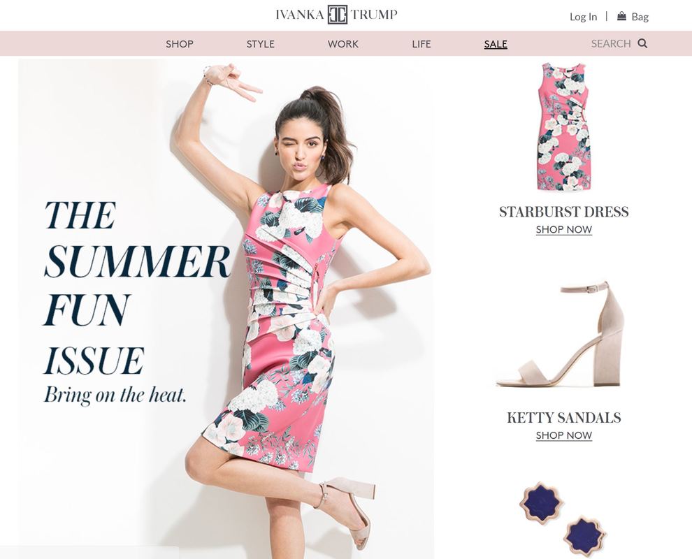 The July 2018 homepage of the Ivanka Trump brand The homepage of the signature Ivanka Trump brand features a model in a bright floral and flamingo pink dress, the headline reading, “The Summer Fun Issue.” Flamingo pink is a bright, fun color, but looking at the rest of the site reveals that the site is suffering from color disharmony, which could be considered one of the contributing factors to the end of the brand. We look to the natural world to create harmonious color schemes. In fact, if you look at the online design tool Canva.com, they feature “100 Brilliant Color Combinations,” which are pulled directly from the natural world. They even feature a Color Palette Generator where you can upload your own images and the tool automatically pulls harmonious shades and creates a custom color palette for you. Trump’s brand would have fared better had they used this tool in the beginning design stages. 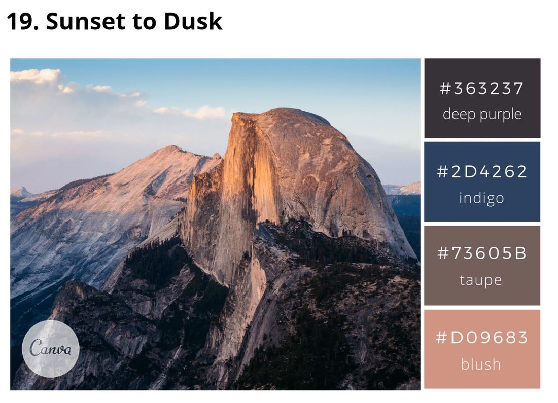 One of Canva's "100 Brilliant Color Combinations" Just where exactly did she go wrong? It’s all in the pink. The natural world offers us four distinct harmonious color groupings. When brands pull all their colors from one of the groups, they communicate a strong, positive message. If a brand accidentally pulls even just one shade from a second group to include in their palette, that tips the balance of their entire color scheme, causing the negative aspects of the colors included to be communicated instead of the positive. Trump’s brand made its first mistake by mixing pinks from multiple groups in the palette. The four harmonious color groups can be referred to as Groups 1 through 4, but are also often referred to in terms of season – Spring, Summer, Autumn, and Winter. Group 1, Spring, colors are light, bright, and warm. They are full of hope and aspiration, think of spring grasses and buds. Group 2, Summer, colors are cool, delicate, and muted. Think of bleached stones on the ocean shore. Group 3, Autumn, colors, are warm, rich, firey, and vibrant. Think of autumn leaves at peak leaf season in New England. Group 4, Winter, colors, are cool, dramatic, and clear. Think fields of white snow with bright red berries. Ivanka Trump’s brand palette features a dominant grayed muted pink, putting it in Group 2, Summer. Links on her website are a shade of bright coral pink, based in Group 1, Spring. The illustrations feature a mixture of warm and cool pinks. Then many of the image still lifes feature objects in bright Group 4 Winter pinks, such as the hand weights in "The Round Up: Healthy Habits" article below. 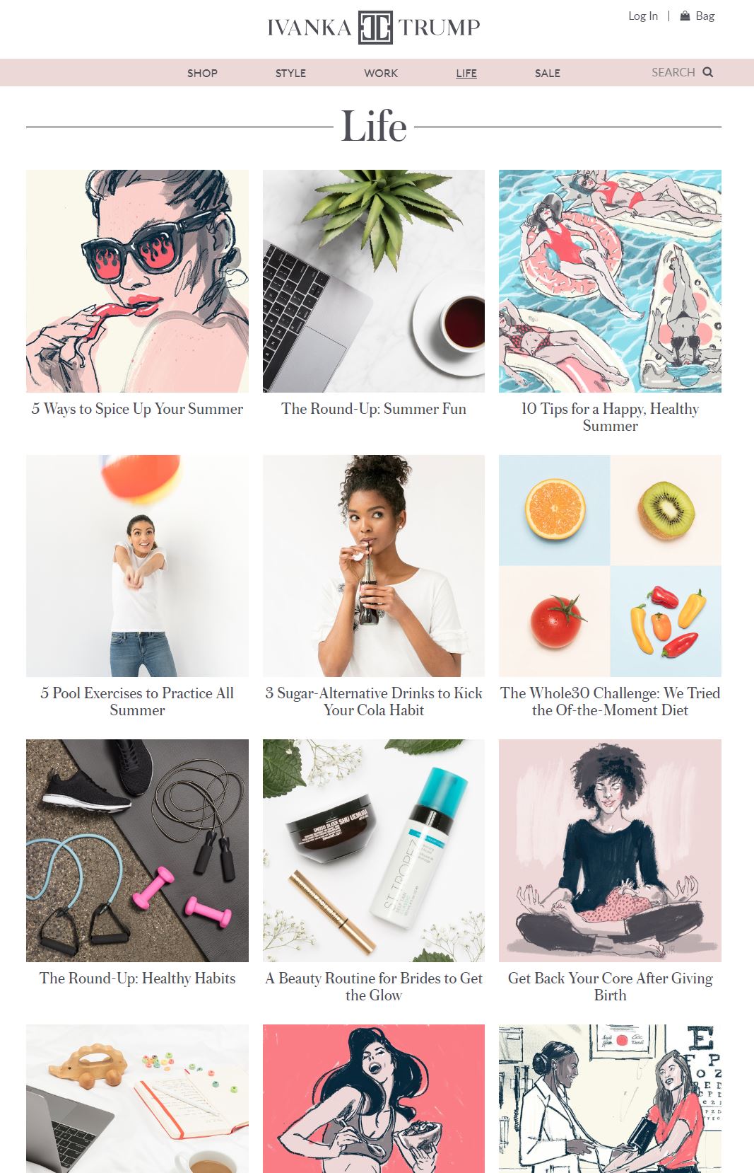 And it is not only the mixing across color groups in one brand palette that can turn a scheme sour. The other faux pas in brand styling is choosing the wrong group to base your brand palette in to begin with, hence Trump’s mistake number two. While basing the Ivanka Trump brand palette on a Group 2 pink seems like it would be a good idea, Summer palettes are not ideal for retail business. Most Group 2 colors contain shades of gray. Humans innately respond to large amounts of gray by turning inward. Think about what happens when the earth changes to gray in the fall. We naturally want to go into hibernation mode. It's not the time we will freely get out our wallets. When used correctly, the positive aspects of the Group 2 Summer colors communicate calmness, responsibility, orderliness, and caring, and are great for non-profits such as historic estates who are in the business of preservation. Health care businesses also do well to use Group 2 as they not only communicate caring, but are also are such relaxing, calming colors. I use Group 2 colors to decorate my home, as I like to feel relaxed at the end of the day. However, they just don’t work for retail. What group should Ivanka Trump have pulled from? Group 4, Winter. Any brand that wants to cater to the high-end sector should be based in Group 4. Group 4 colors project the qualities of being dramatic, forward-thinking, and modern. They are extreme. They are either very saturated or very light, and always cool. Pure black and pure white fall into Group 4. Primary colors also fall into Group 4. Beyond color, each harmonious group has particular design elements and characteristics associated with it. The typographic styles that fall into Group 4 are fonts that are minimalist and classy, so you will often see high-end brands with either fine serifed or sans-serifed wordmarks, such as Christian Dior, Tiffany & Co., Kate Spade, and Gucci. Ivanka Trump followed suit with her name, however, she chose a clunky logomark to go along with it. Design elements with substance, such as her logomark, fall into Group 3. 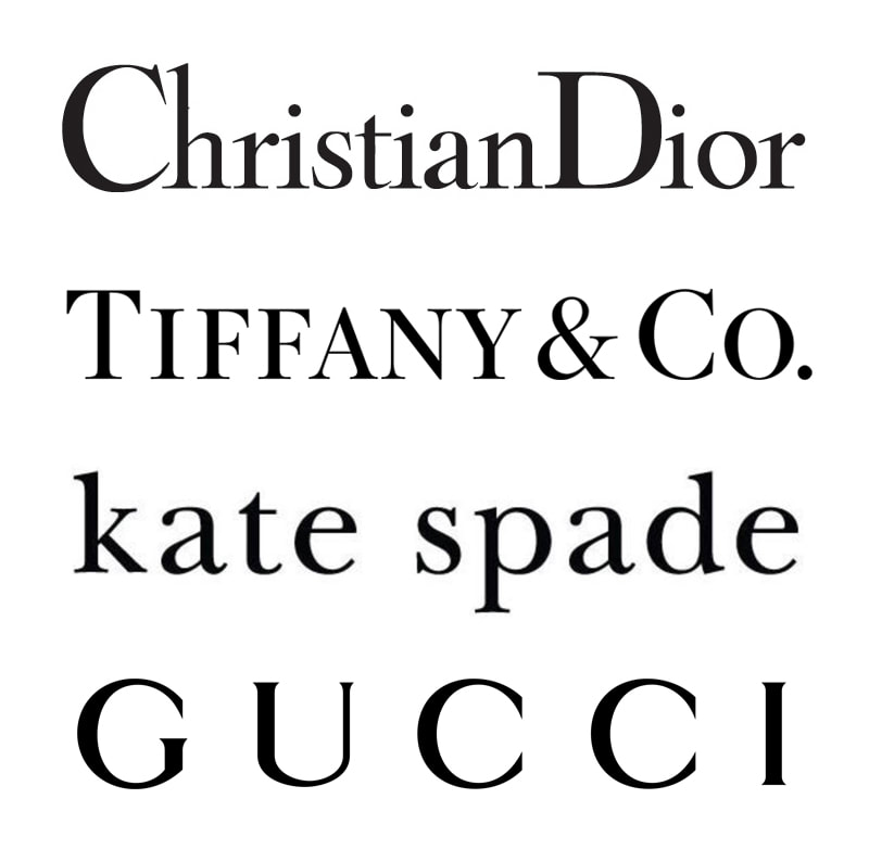 Examples of high-end fashion wordmarks Unlike mixing colors, it is fine to use a supporting group to communicate a supporting element of your brand. If Trump had used a Group 4 icy pink to communicate the high-end, high-fashion elements of her brand, then it would have been fine to bring in design elements from Group 3. The characteristics of Group 3 that would have suited her brand would be intelligence, substance, and practicality. The Ivanka Trump brand was designed to attract professional women with careers and family, and using Group 3 elements in a supporting role would have worked, as her target market was for women who wanted to be known for their intellect and ability to manage career and family. It is unfortunate then that the brand’s color palette landed all over the color map. The positive attributes of the color pink, which I am sure were pieces that the brand aspired to communicate, would have been femininity, nurturing, and warmth. However, using pinks from multiple groups triggered the negative aspects – frivolity, emasculation, and physical weakness. Beyond the political climate, you could fathom that these two mistakes – using colors across multiple groups and basing the primary brand color in relaxed Group 2, not at all suited for retail, were the beginnings of the downfall of the brand. When your brand palette is composed of the right colors, you communicate a strong message, which will attract a strong following. If this had been the case, the brand might have held on to its fan base, no matter the storms facing its owner. |
Jenny CBrand stylist, colorist, graphic designer, web developer, marketer & mom, dedicated to making the world a more harmonious place Archives
May 2022
Categories
All
|


 RSS Feed
|
Looking for entrepreneurial insights?
I am a co-host of the Sisters Talk Shop podcast, available on your favorite podcast streaming service. |
"The secret of getting ahead is getting started."
~MARK TWAIN "If one is lucky, a solitary fantasy can totally transform one million realities."
~MAYA ANGELOU |