|
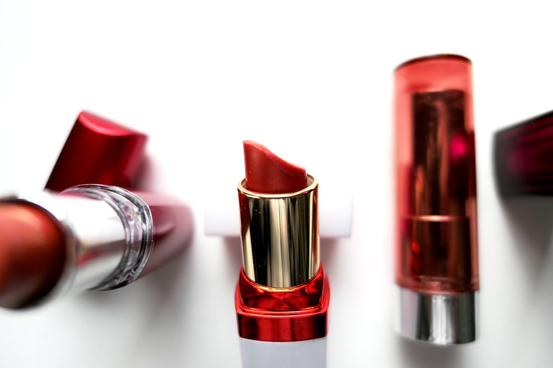
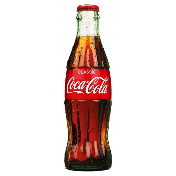
Red is a very powerful color. Just looking at it raises your blood pressure and whets the appetite. Red is physical, it is the color of life itself. Red blood, red lips, full red tulips and roses. Apples beckoning you to eat them, bright red berries enticing you with promised sweetness. Red screams come closer and consume me. It is associated with masculinity, and exudes strength and power. (Let's just be clear here – women have just as much strength and power, this color just happens to communicate the strength and power of the male variety.) Super heroes done red capes, and countries often choose it for their flags. Red is one of the colors that jumps out at you and makes you think it is closer than it really is. Which makes it an excellent choice for stop signs and red lights. It also makes it an excellent choice if you have a brand that you want to be noticed. The most prominent brand of all time uses red as its main brand color: In fact, before Coca Cola, Santa Claus wore white. Which makes sense, it's the color of snow and winter. But then in came Coke and published the iconic image of Santa in Coca-Cola red robes downing a bottle of the sugary liquid. And ever since, at least in the U.S., Santa has donned only red ensembles. Side note - it is in thanks to Finnish artist Haddon Sundblom (1899-1976), commissioned by the US Coca Cola company, who painted the first Santa in red drinking coke in the 1930s. In languages that only have two words for colors, those are black and white. But in languages that have three words for color, those are black, white, and red. If you want to build your brand around one of the following, red would be a good choice to use as your main brand color,
For example, here are some brands who want to make us hungry for food; And some who want to make us hungry for adventure and excitement; Once you have decided that red should be in your palette, next you will need to choose the shade of red. Here is where our secret weapon of applied color psychology comes in. If this is the first time you have heard of color psychology, go ahead and jump over to my explanation here. You can also download the Brand Personality Traits by season handout to see if you can get a better idea of which of the four groups your brand should be based in, based on the traits you want your brand to be known for. Here are guidelines for which shade of red to choose, depending on which group your brand is based in-- Group 1: Spring reds will be light and cheerful. They will have more yellow in them vs. blue. Think scarlet. Group 2: Summer reds have touches of gray, and no yellow. Mauve and maroon fall into this category. Group 3: Autumn reds are vibrant and rich. They have more yellow in them. Think of the old masters paintings with that rich, vermillion red, or of leaves in the fall that have transformed from green to red before alighting to the ground. Group 4: Winter reds are crystal clear and powerful. They are primary red, crimson and ruby, imagine deep red berries in winter against the white of new fallen snow. What to watch out for when choosing a redIf you have chosen the right shade of red to match the color harmony of your brand palette, it will communicate the energy, passion, and excitement you mean to communicate. However, if your brand color palette contains more than one color, or multiple shades of the same color, please take caution to choose all of these hues from the same harmonious color group. If you mix in a disharmonious color, the negative aspects that the red will communicate include:
The best example of the misuse of red was when it was mixed with pure black in the Nazi swastika logo. The only colors that should be paired alongside black in branding are those in Group 4: Winter. If your brand is based in a different group and you would like a dark black-like color to use in your copy or on your website, opt for a darker shade of gray from that group. Using applied color psychology to confidently chose your brand's color paletteChoosing colors for your brand palette doesn't have to be as hard as rocket science, and in fact can be much more quickly chosen with confidence when using the science of applied color psychology. The steps to choosing brand colors that attract and communicate are as follows,
I'm hoping that you are now a bit more acquainted with the color red and what it means, especially related to branding and communication. I challenge you to start noticing the brands that use red. What do they sell? How would you describe their brand personalities? What are they trying to convey with the use of red? Which of them is conveying a personality similar to your brand? Do they pull you in more quickly than other brands? Do you feel your pulse increasing? Good luck with your color choices!
0 Comments
Leave a Reply. |
Jenny CBrand stylist, colorist, graphic designer, web developer, marketer & mom, dedicated to making the world a more harmonious place Archives
May 2022
Categories
All
|
|
Looking for entrepreneurial insights?
I am a co-host of the Sisters Talk Shop podcast, available on your favorite podcast streaming service. |
"The secret of getting ahead is getting started."
~MARK TWAIN "If one is lucky, a solitary fantasy can totally transform one million realities."
~MAYA ANGELOU |


 RSS Feed
