The 2 Major Mistakes: How Ivanka Trump’s Brand Palette Contributed to the Demise of the Business7/27/2018 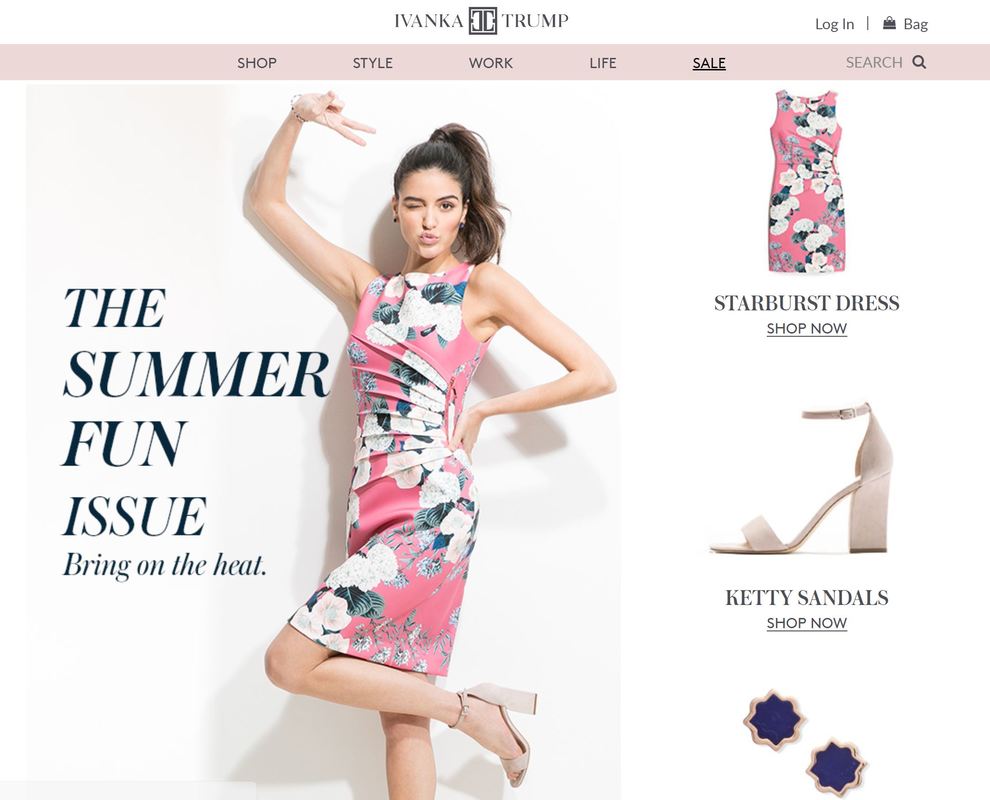 The July 2018 homepage of the Ivanka Trump brand The homepage of the signature Ivanka Trump brand features a model in a bright floral and flamingo pink dress, the headline reading, “The Summer Fun Issue.” Flamingo pink is a bright, fun color, but looking at the rest of the site reveals that the site is suffering from color disharmony, which could be considered one of the contributing factors to the end of the brand. We look to the natural world to create harmonious color schemes. In fact, if you look at the online design tool Canva.com, they feature “100 Brilliant Color Combinations,” which are pulled directly from the natural world. They even feature a Color Palette Generator where you can upload your own images and the tool automatically pulls harmonious shades and creates a custom color palette for you. Trump’s brand would have fared better had they used this tool in the beginning design stages. 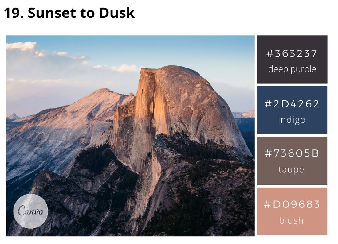 One of Canva's "100 Brilliant Color Combinations" Just where exactly did she go wrong? It’s all in the pink. The natural world offers us four distinct harmonious color groupings. When brands pull all their colors from one of the groups, they communicate a strong, positive message. If a brand accidentally pulls even just one shade from a second group to include in their palette, that tips the balance of their entire color scheme, causing the negative aspects of the colors included to be communicated instead of the positive. Trump’s brand made its first mistake by mixing pinks from multiple groups in the palette. The four harmonious color groups can be referred to as Groups 1 through 4, but are also often referred to in terms of season – Spring, Summer, Autumn, and Winter. Group 1, Spring, colors are light, bright, and warm. They are full of hope and aspiration, think of spring grasses and buds. Group 2, Summer, colors are cool, delicate, and muted. Think of bleached stones on the ocean shore. Group 3, Autumn, colors, are warm, rich, firey, and vibrant. Think of autumn leaves at peak leaf season in New England. Group 4, Winter, colors, are cool, dramatic, and clear. Think fields of white snow with bright red berries. Ivanka Trump’s brand palette features a dominant grayed muted pink, putting it in Group 2, Summer. Links on her website are a shade of bright coral pink, based in Group 1, Spring. The illustrations feature a mixture of warm and cool pinks. Then many of the image still lifes feature objects in bright Group 4 Winter pinks, such as the hand weights in "The Round Up: Healthy Habits" article below. 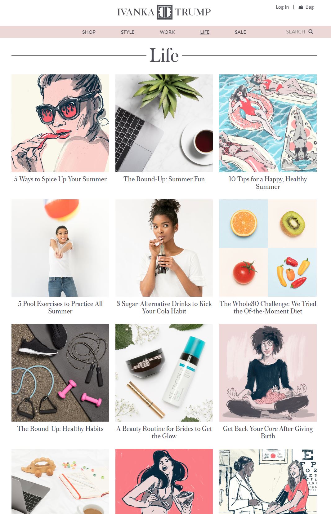 And it is not only the mixing across color groups in one brand palette that can turn a scheme sour. The other faux pas in brand styling is choosing the wrong group to base your brand palette in to begin with, hence Trump’s mistake number two. While basing the Ivanka Trump brand palette on a Group 2 pink seems like it would be a good idea, Summer palettes are not ideal for retail business. Most Group 2 colors contain shades of gray. Humans innately respond to large amounts of gray by turning inward. Think about what happens when the earth changes to gray in the fall. We naturally want to go into hibernation mode. It's not the time we will freely get out our wallets. When used correctly, the positive aspects of the Group 2 Summer colors communicate calmness, responsibility, orderliness, and caring, and are great for non-profits such as historic estates who are in the business of preservation. Health care businesses also do well to use Group 2 as they not only communicate caring, but are also are such relaxing, calming colors. I use Group 2 colors to decorate my home, as I like to feel relaxed at the end of the day. However, they just don’t work for retail. What group should Ivanka Trump have pulled from? Group 4, Winter. Any brand that wants to cater to the high-end sector should be based in Group 4. Group 4 colors project the qualities of being dramatic, forward-thinking, and modern. They are extreme. They are either very saturated or very light, and always cool. Pure black and pure white fall into Group 4. Primary colors also fall into Group 4. Beyond color, each harmonious group has particular design elements and characteristics associated with it. The typographic styles that fall into Group 4 are fonts that are minimalist and classy, so you will often see high-end brands with either fine serifed or sans-serifed wordmarks, such as Christian Dior, Tiffany & Co., Kate Spade, and Gucci. Ivanka Trump followed suit with her name, however, she chose a clunky logomark to go along with it. Design elements with substance, such as her logomark, fall into Group 3. 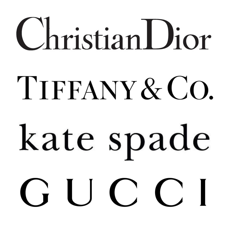 Examples of high-end fashion wordmarks Unlike mixing colors, it is fine to use a supporting group to communicate a supporting element of your brand. If Trump had used a Group 4 icy pink to communicate the high-end, high-fashion elements of her brand, then it would have been fine to bring in design elements from Group 3. The characteristics of Group 3 that would have suited her brand would be intelligence, substance, and practicality. The Ivanka Trump brand was designed to attract professional women with careers and family, and using Group 3 elements in a supporting role would have worked, as her target market was for women who wanted to be known for their intellect and ability to manage career and family. It is unfortunate then that the brand’s color palette landed all over the color map. The positive attributes of the color pink, which I am sure were pieces that the brand aspired to communicate, would have been femininity, nurturing, and warmth. However, using pinks from multiple groups triggered the negative aspects – frivolity, emasculation, and physical weakness. Beyond the political climate, you could fathom that these two mistakes – using colors across multiple groups and basing the primary brand color in relaxed Group 2, not at all suited for retail, were the beginnings of the downfall of the brand. When your brand palette is composed of the right colors, you communicate a strong message, which will attract a strong following. If this had been the case, the brand might have held on to its fan base, no matter the storms facing its owner.
0 Comments
Leave a Reply. |
Jenny CBrand stylist, colorist, graphic designer, web developer, marketer & mom, dedicated to making the world a more harmonious place Archives
May 2022
Categories
All
|
 RSS Feed
|
Looking for entrepreneurial insights?
I am a co-host of the Sisters Talk Shop podcast, available on your favorite podcast streaming service. |
"The secret of getting ahead is getting started."
~MARK TWAIN "If one is lucky, a solitary fantasy can totally transform one million realities."
~MAYA ANGELOU |