|
As a creator, I have always loved Etsy. A big fan of orange, I love their logo and branding. I love that they provide a popular platform for small creators to compete with larger ones. And I love being able to heart things and then look at all the things I love on one screen, similar to Pinterest. Which is why I was so excited when my sister Lisa told me she had an interview lined up for us with an Etsy creator for one of our Sisters Talk Shop episodes. 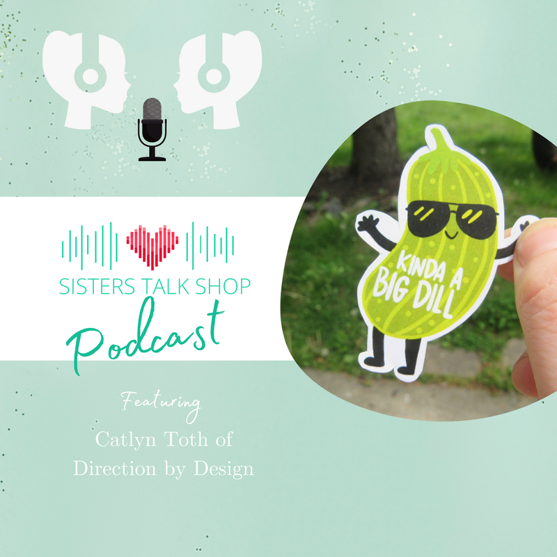 Have you ever day dreamed about starting your own Etsy shop? I can't wait for you to listen to this episode and discover how Catlyn Toth took a passion for doodling and turned it into this fabulous Etsy sticker shop! In the midst of the pandemic, Catlyn, who is a 3rd grade teacher, needed a creative outlet. Since she was young, drawing and art had been in her blood. Her great grandmother was an amazing artist. She was watching Star Wars one night with her partner and was doodling little Star Wars-inspired stickers on her Ipad. She gave some out to her family, which turned into her friends, which turned into her colleagues. And they couldn't get enough of them! Her optimistic and colorful doodles began inspiring others, and Direction by Design was born. Join us as we travel through Catt’s journey to e-commerce success and learn how she cultivates community through her artwork. Her “Kinda a Big Dill” pickle sticker is one of Lisa and my favorites! 🎧 Listen Here Glorious Webpage FindsI can't leave you without a favorite website to share:  How do you strike a balance between looking high-end but also being friendly?
I came across the website for a company called High Value Strategic Advisorsand they have done just that. High End + Approachability - They achieve this spectacular balance with the simplicity of the layout - look at all that white space with not even any navigation items to clutter it - along with hand drawn friendly illustrations and a serifed Abhaya Libre heading font that not only has lots of substance, it does not take itself too seriously. And of course it is paired with my go-to Group 3 Roboto font for the paragraphs. Illustration - Not only is it hand drawn, it is also the ONLY illustration on the site that is repeated throughout. And it mirrors the homepage hero photograph. Photography - You get the brazen, stark, wintry road that is the photographic equivalent of the logo graphic, paired with city offices, families, and some close-ups of laptops and people's work. All photos have a darker, authentic Group 3 style. While this website is only one page, they put a lot of thought and effort into making it communicate the high-end value of the service with the friendliness and approachability of the consultant. Would you like to be featured on a future episode of Sisters Talk Shop? Do you have a favorite website to share? Email [email protected] or [email protected] and let's chat!
0 Comments
Leave a Reply. |
Jenny CBrand stylist, colorist, graphic designer, web developer, marketer & mom, dedicated to making the world a more harmonious place Archives
May 2022
Categories
All
|
 RSS Feed
|
Looking for entrepreneurial insights?
I am a co-host of the Sisters Talk Shop podcast, available on your favorite podcast streaming service. |
"The secret of getting ahead is getting started."
~MARK TWAIN "If one is lucky, a solitary fantasy can totally transform one million realities."
~MAYA ANGELOU |