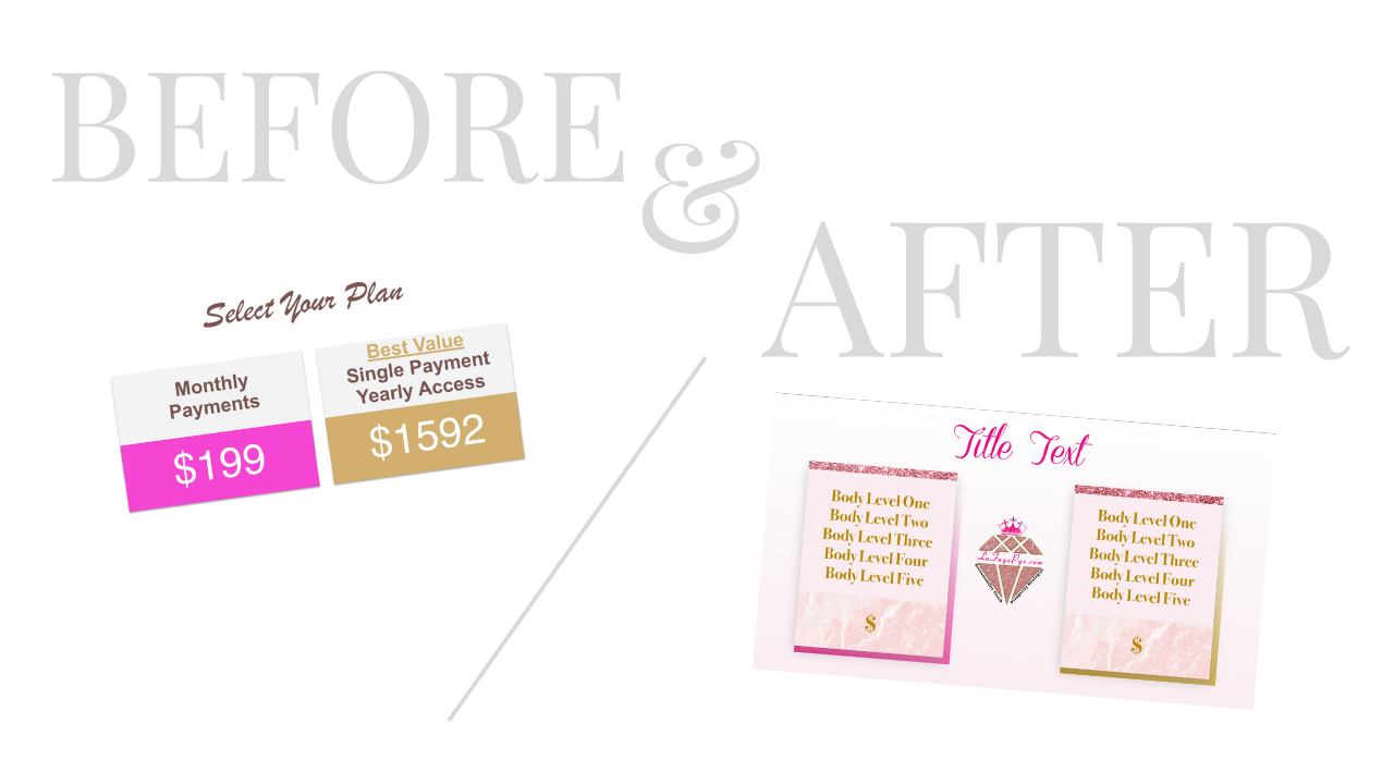
 LaFaye Pye, the Prosperity Strategist, is one of my business besties. We met via an intensive 6-week online course (of course!) in which it turned out that there were only a small handful of us who posted regularly and did our best to keep up with the content. After this course was finished, we all had to take a step back from what we were working on to decompress. But I would never trade that experience as all the amazing friendships that have come out of it. When LaFaye was going through a re-brand, she brought me in to help. We looked at her current color scheme and visual elements, and talked through exactly what she was trying to communicate. She was very attached to her pinks and browns, only they weren't quite the right shades to communicate her position as an expert in her field. She was also attached to the Summer color psychology group with its flowing and feminine elements. To communicate her expert status, we tweaked her palette to encompass a Winter color scheme, and then added in Summer through her lovely feminine elements such as fonts and patterns. Here is her final brand identity style sheet (note: I did not create this final version, but I do love it!)-- 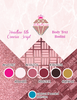 Recently she brought me back in to help with her graphics to update her webinar slide deck. She runs the Business Builders Lab, and was getting ready for a big launch of her new program, the Visible Woman. Her slides were okay, but they didn't have a cohesive look and feel, and they were not on brand. You can see from this "before" slide that the font she was using was big and clunky (great for Autumn brands) and the colors weren't right. Notice the gray shadow - while it is just a supporting element on the page, it does not harmonize with the palette.  Here is another example of her "Before" slide listing the package prices, and then the updated slide I created for her: 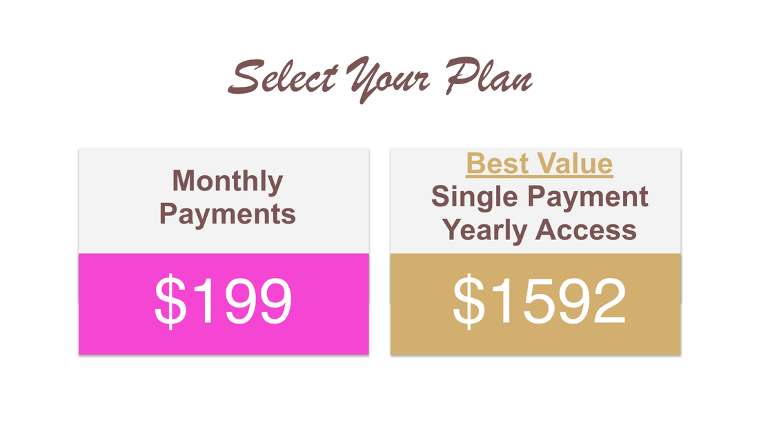 After: 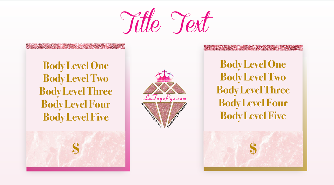 Luckily all her deck needed was a little bit of magic that gave it a classy, upscale feeling to reflect her brand. Here is a screenshot of the final master slide templates; 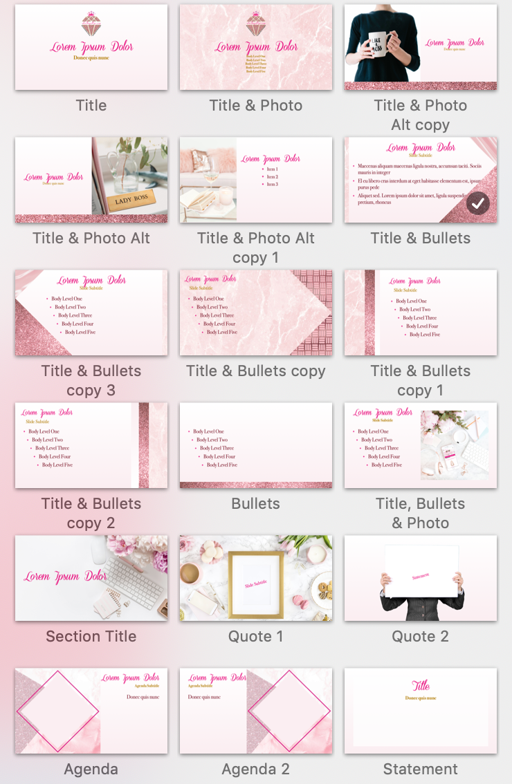 Now she has over 25 slide templates to chose from (not all pictured) when pulling together her webinars for the Business Builders Lab and, coming soon, The Visible Woman and the Marketing Map. Stay tuned!
0 Comments
I met with Misty at a cute corner coffee shop in downtown Bath, Maine, the city of ships. Cafe Creme is the hangout of choice for many of the locals and boarding school students alike. Its intimate atmosphere encourages conversation and camaraderie, and the sea of treats under glass domes at the counter along with row of local coffees along the wall encourages you to stay awhile. Misty had heard about me from my SCORE mentor. If you are unfamiliar with the SCORE program, its mission is to match entrepreneurs with seasoned business veterans. Misty, a mom with young kids like myself, was a massage therapist by trade, and working on developing an incredible app she called Thoughtful Giving. At the time she had entered the LA Top Gun competition to win funding for her business idea and wanted to connect with me to learn more about branding and design. I was more than happy to meet with her as one, she was obviously a fellow go-getter, two, I love talking branding and design, and three, my mom ran a gift shop my whole life up until this past year so I felt Misty would be a kindred spirit. Once we had our coffee and pastries in hand, she explained to me the beautiful idea she had that was the Thoughtful Giving app. "If you have nieces and nephews and want to get them a gift for their birthday, you always have to ask their shoe size, their clothing size, who their favorite super hero is etc. This app will allow you to share profiles of you and your family members with friends and family so they will always have access to the crucial information needed to purchase gifts," she said. "Furthermore," she continued, "it will be connected with banks so you can contribute to their college fund, or make a donation to a cause they support." As a mom myself who gets invited to birthday parties, this idea sounded brilliant. No more having to interrupt my friends and family members to ask what they or their children wanted for holidays and birthdays. I told Misty about the applied color psychology system I use to style brands, and we went over Spring, which she absolutely needed to use as either the dominant or supporting season as it communicates youth and aspiration, and Autumn, as Autumn communicates friendliness and philanthropy. I sent her home with printouts of the Spring and Autumn style cheat sheets, and wished her good luck in the competition. Fast forward to a year later, and Misty reached out again to see if I was interested in helping her create a brand identity for the app. She had a developer on board and with Covid, was able to spend more time than usual on forging ahead with launching this oh-so-helpful app. I told her about my Done & Dusted special, and we set up a time for our first meeting to go over the brief. Now, as we had already spent some time together in person talking about this brand, I felt I had a good grasp on what she was looking for. Our first meeting went more quickly than most. We went through her answers to the questions I have anyone working with me fill out and then I told her I was excited to get to work on the project. Here is her original logo that she had created for the Top Gun competition. She hired someone on a design site I believe for $25 to get this created: The colors are not harmonious, and while it is very legible, it feels like someone used clipart to throw together. I started with creating a new color palette pulling from Autumn. These colors are so rich and lovely, they unconsciously pull you in. Here is the palette I created for her,
I then worked on creating a logo. Now, I love the raspberry color, and felt it was very festive. So all the logo designs I worked up used this as the main color. Here is one of my first designs also showing some of the different gift images she could choose from:
However, on our next Zoom meeting, we decided to go back to the original main colors of orange and teal as the dominant colors. Orange because it communicates warmth and abundance. And teal because it's a blend of the nice balancing and abundance properties of green and communicative properties of blue. A gift is a type of communication that you appreciate someone. We spent quite some time both apart and together looking at typefaces. We tried Andika, Arapey, Arima Madurai, Bellota Text, Comfortaa, Harmattan, Mada, Thasadith, and ultimately decided upon Mallanna. It was friendly and simple, easy to read on a very small screen. As for the gift, we liked the one with the gradient package, and knew we wanted to keep the heart-shaped bow from the blue clipart gift. I tried doing a small tweak and seeing what it would look like if the ribbon jumped up and crossed the "T" of Thoughtful, but ultimately we decided to keep the gift on its own as it was more legible across applications. Gift with the ribbon on the "T":
And here is the final logo:
I also created a few different versions that could be used across different applications:
Lastly, I created a mock up of what the phone app image could look like:
Now that we had the logo finalized, it was time to continue with the brand identity creation. In order to do this, I find it is easiest to find an application to which you are going to apply the brand style. Luckily for me, Misty had shared with me a Word document mock-up of what one of the profiles would look like. BEFORE:
We had used Autumn colors, so I knew we next needed to add some Spring elements to bring that lightness and aspect of future aspiration. I created a fun confetti pattern of little repeating triangles in the brand colors.
Next I found some icons on Canva.com that allowed me to edit their colors to match the brand identity colors.
And I knew it needed a bit of a gradient pop so added this texture:
Then we played with typefaces in a Word document to decide on a fun heading font and a simple paragraph font. Here is the final profile mock-up with our updated brand style elements applied. AFTER
This is what the app would look like if you were logged in on a computer, and we talked a bit about how it would be designed differently as a phone app. We did a Google image search around phone app user interfaces and Misty now has an idea of what she likes. Once the developer is ready for a user interface, that will be the next piece to design. The Thoughtful Giving app now has a one-page style guide, so Misty is able to easily share the styles with anyone working on the project.
Good luck to Misty, and I know I am excited to be able to use this amazing app!  I did a live Masterclass on the 4 critical ingredients you need to create a delectably memorable brand. But what if YOU are the brand? How do you apply these four elements to yourself?
Let's recap. The four elements you need to whip up that brand are: 1. History (a past) 2. Culture (a place) 3. Brand Personality (character) 4. Typical Customer (an aspirational self-image) Related to YOU, here is what you need to think about: History What is your personal story? Why did you want to create this brand? One of my good business friends LaFaye Pye , the Prosperity Architect, tells the story of how she was stuck in bed for months on end with a back problem. Before getting hurt, she taught nutrition and was well known for her delicious and healthy recipes. But it didn't light a spark in her. While she was unable to walk, she realized that what she really wanted to do was help female entrepreneurs get their businesses off the ground. (Sound similar? Yes, we both have a similar passion!) She now teaches strategy and mindset and couldn't be happier. I'm a big fan of her Business Builder's Lab. Why did you start your business? Who did you want to help and why? Culture When you meet someone new, what is one of the first questions you want to ask them? Yes! Where are you from, or where do you live? We identify certain traits and aspects to the communities and places where people are from. Use this to your advantage. You might feel like the only country girl, but I am sure there are loads of fellow females in the same situation who would bond with you over this one fact about yourself. Brand Personality This is your personality when you are working on your business. It is your professional personality. At home, you might be cooky and silly, but when you're working on your business, you are refined and knowledgeable. It's okay to be both! Just know which one is your brand. Typical Customer Can you be someone's typical customer? Can you be their ideal? I know I purchase products and services from people I look up to and wish I had one or many of their gifts. Embody that person who not only you aspire to be, but they also aspire to be. Branding may not be rocket science, but it does take work. There's lots to think through, pull out and investigate, and dive deeper into. I hope this four-element framework has been helpful! Remember, in the end, your brand is not what you say it is, it is what your customers think it is. So if you can consistently communicate the image you want, that will hopefully be the image that they hold onto and love. |
Jenny CBrand stylist, colorist, graphic designer, web developer, marketer & mom, dedicated to making the world a more harmonious place Archives
May 2022
Categories
All
|


 RSS Feed
|
Looking for entrepreneurial insights?
I am a co-host of the Sisters Talk Shop podcast, available on your favorite podcast streaming service. |
"The secret of getting ahead is getting started."
~MARK TWAIN "If one is lucky, a solitary fantasy can totally transform one million realities."
~MAYA ANGELOU |